Too many BBC iPlayer searches on it ended with nothing played.
As the designer responsible for search, I redesigned it for TV, web and mobile, turning an empty search box into a place to browse. The first version went live and drew positive feedback from users.
COMPANY
BBC, the world's largest public service broadcaster
MY ROLE
Senior UX Designer
GOAL
Reduced clicks/time to playback
TOOLS
Figma, Proto.io, Principle, Origami, Zeplin
Problem
Quant studies showed rivals beat iPlayer on ease of use, and a high share of search sessions ended with no programme played. It's a problem across streaming: most viewing starts from browsing rather than typing a title, only 16% of UK viewers know what they want to watch when they start.
The goal was to make search easier to use and turn more searches into plays.
Process
Understanding. I watched people find shows on iPlayer and rival services, noting where they got stuck, and asked them which factors mattered most to them.
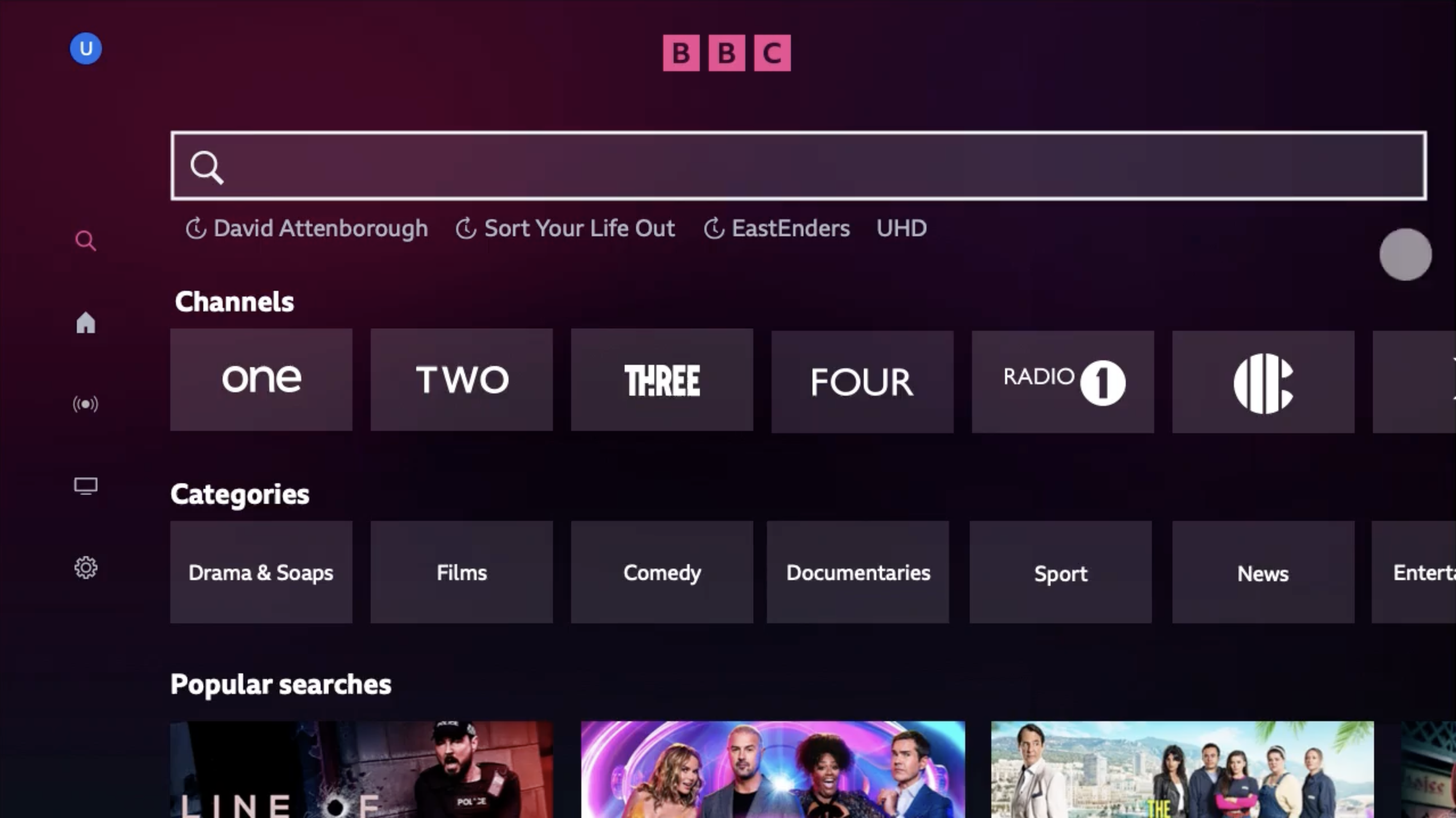
Design. Most people don't arrive with a title in mind, so a blank search box is a dead end. I designed search to help people browse as well as find, and stripped the interface back to the essentials so it stayed quick to use, especially with a TV remote.
Prototyping. I built prototypes in Proto.io for mobile, web and TV, to feel how search worked with touch, mouse and remote, and tested them with users before build.
Solution
A search box that browses: before anyone types, search shows categories and channels, so people without a title in mind still have somewhere to start.
Recent searches: past searches appear first, so viewers get back to a show in one step.
Three words per show: each result describes its subject, tone and mood in three keywords, so people can judge an unfamiliar show at a glance.


Results
- First version released to iPlayer users on TV, web and mobile
- Positive feedback from users on social media
Credits
UX
Tom Killeen
User Research
Selena Whitehead
Product
Graham Hoyle
Engineering
Sam Bason