Shortly after joining the BBC I led the discovery and delivery phases of a new native app with an aggressive launch date
Business goal
To get the key segment of under 35s to regularly consume content from multiple parts of the BBC estate.
Responsibilities
My role was to lead the UX team, which included responsibility for:
- Effective discovery
- On time delivery and successful launch
- Ensuring adoption and development of BBC guidelines
- User research
- Championing accessibility
DELIVERABLES
- A mobile app (Android and iOS)
- Branding and brand guidelines
- Marketing material
SUCCESS CRITERIA
Reach — 1 million downloads in the first year
Frequency — 3x the frequency of use of the BBC homepage
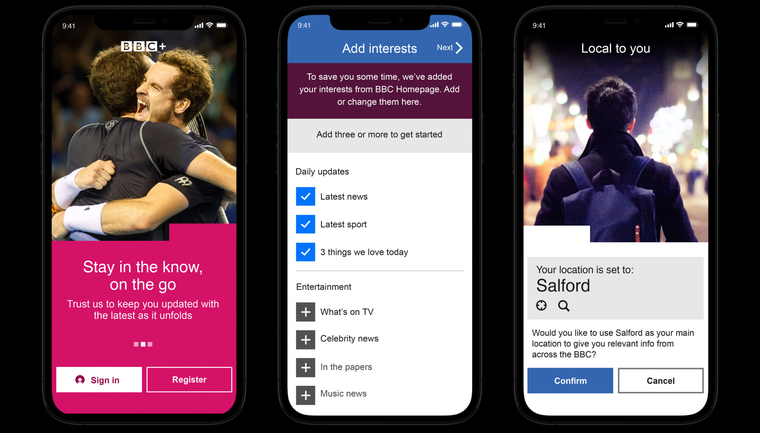
We finely-tuned the onboarding process to maximise engagement and minimise drop-off
The problem
The BBC had a problem with younger people not picking up the BBC habit. It was feared that over time this would cause audience numbers and the perceived value of the organisation to fall.
The insight that kickstarted the project was: ‘users who consume content from across at least two parts of the BBC (e.g. News, Sport, Weather) are much more likely to become lifelong loyal consumers’.
We wanted to give people a way of getting the content they cared about from across the BBC in a way that encouraged positive habitual usage.

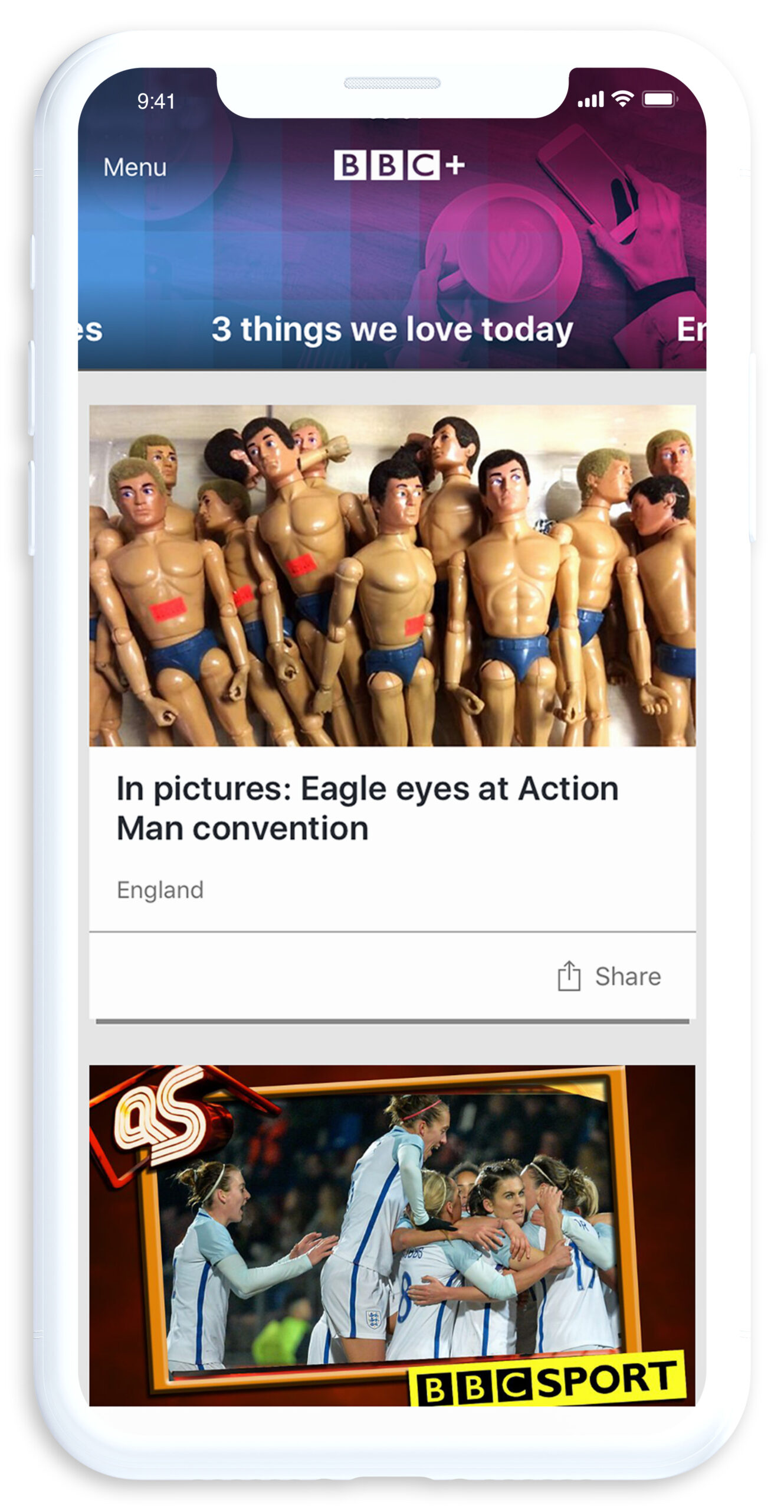
3 things we love today was one of the most popular content collections
Understanding
Before designing, I wanted to make sure we understood our future users and the landscape that we’d be entering.
Here's some of the techniques we used:
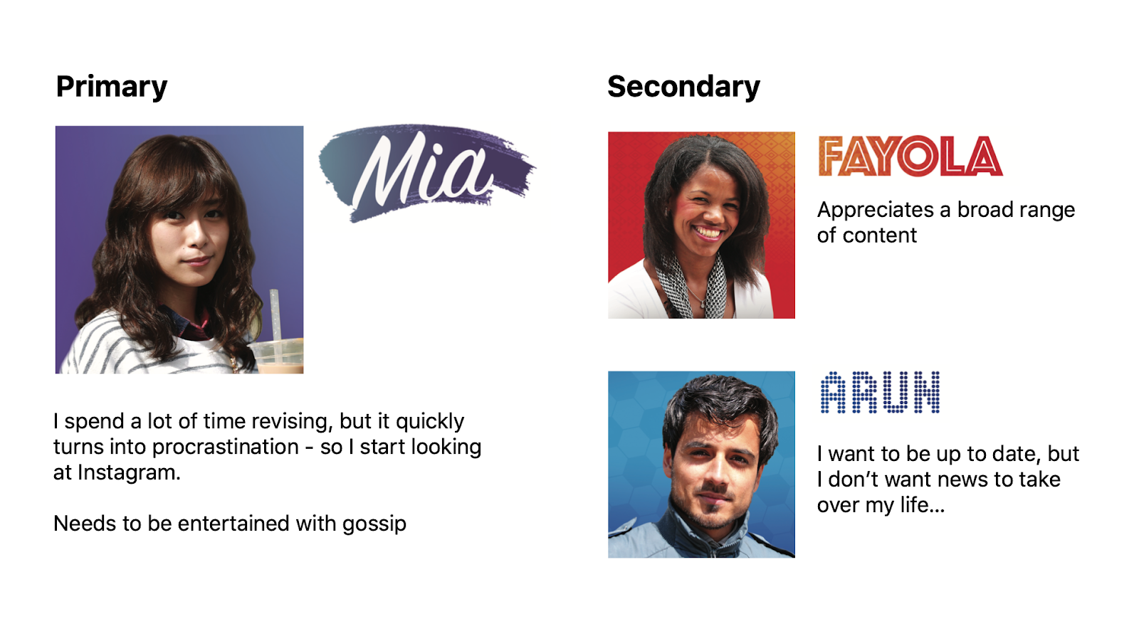
Personas
I worked with other UX teams within my department to create a set of personas that represented our target users. This meant multiple workstreams could benefit from the project.
The personas gave us a shared understanding of who we were making the app for, gave us a marker to assess ideas and informed recruitment for usability testing,
User interviews
We planned a regular series of user sessions. These were used differently depending on the priority at the time. Later in the project they were used to assess the usability of solutions, but early on they were used to generate new ideas, assess the desirability of features and validate and refine the IA model.
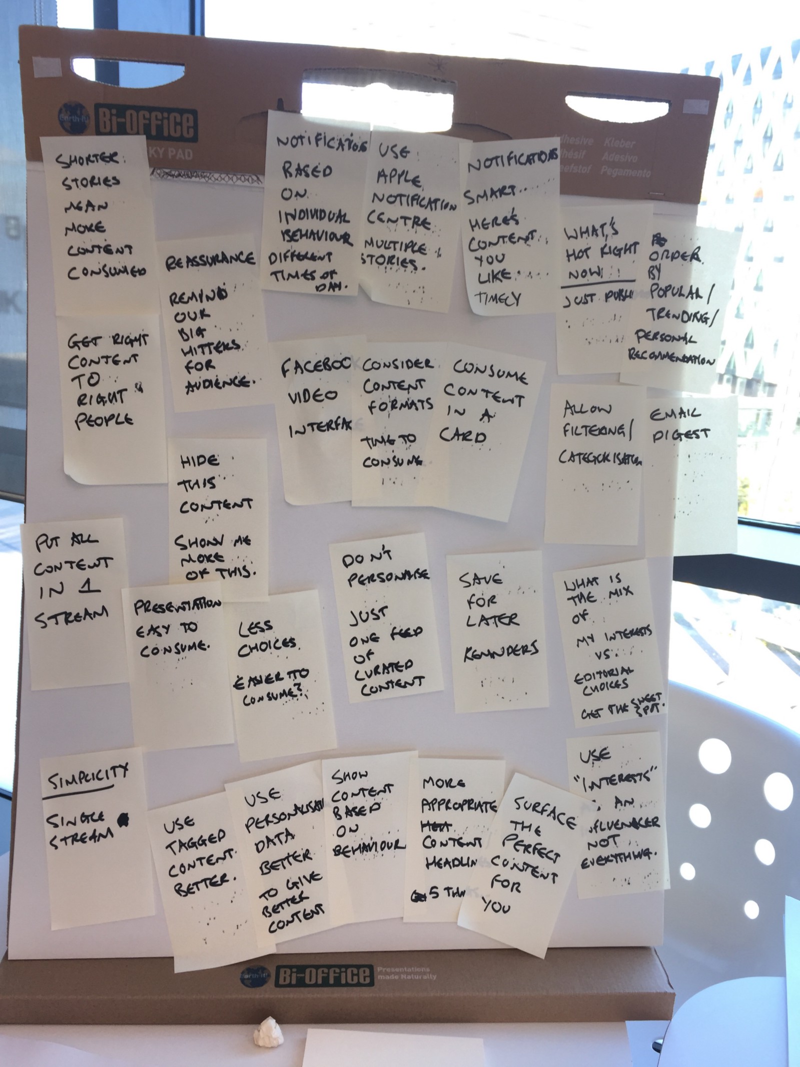
Design challenges
Here’s a few challenges I set the team, based on the insights gleaned from the Understanding phase:
People don’t have time for long sessions, but have many short opportunities in the day.
How might we create valuable, snackable experiences?
People don’t like wasting their time on social media (but they do anyway).
How might we draw users away from social media?
People have many interests, but they don’t want to know about them all at the same time.
How might we give users the right content at the right time?
People appreciate the breadth of BBC content, but they don’t seek it out.
How might we activate new users and retain them?
The scope of work
I had the task of working with the leadership team to create a scope of work and UX delivery plan.


The planning started off very structured, and ended up more pragmatic
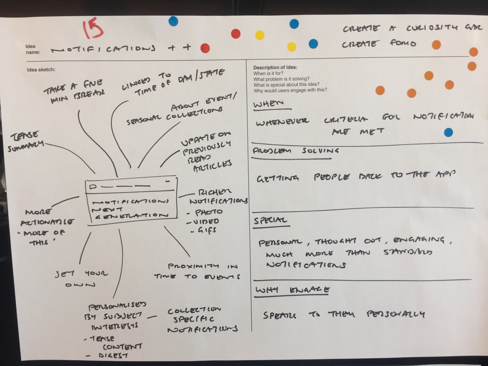
Ideation
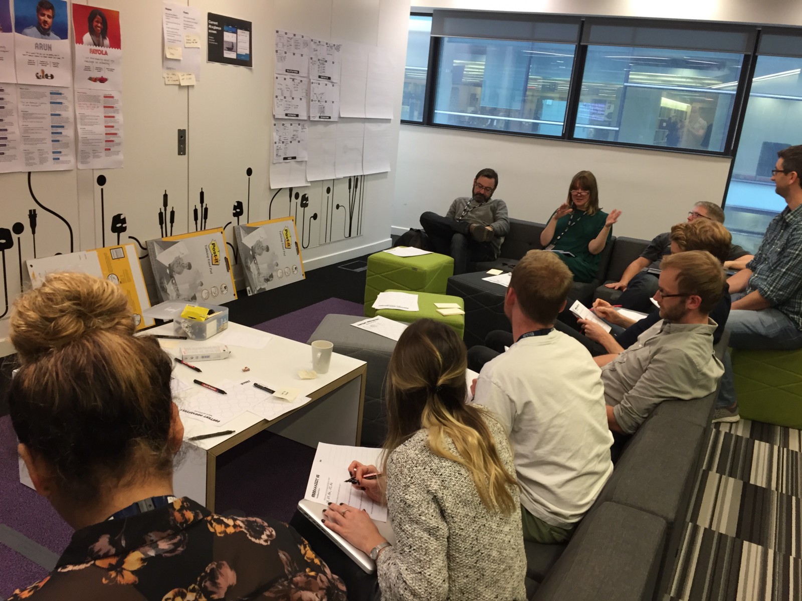
I made the ideation process collaborative, bringing in the cross-discipline team and stakeholders where possible. I wanted to do this to maximise the number and quality of ideas, but also to get shared understanding and buy-in from the team.
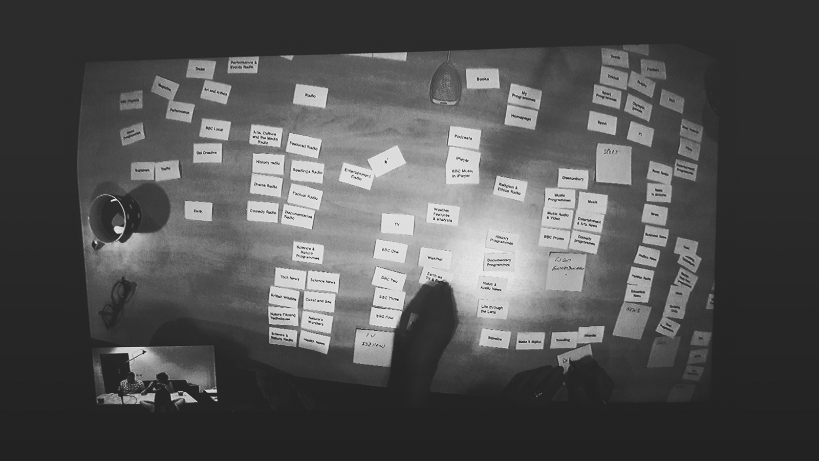
Information architecture
I wanted to organise the app in a way that would let users get to the content they want effortlessly.
We developed a simple, flat architecture, coupled with multiple navigation methods to make it easy to move through the app (and to make it fully accessible via screenreader or switch device).
Journey mapping
Like the information architecture, the journey maps focussed on seamlessly moving the user through the app to the content they wanted, then onto another piece of content after that.
A big challenge was balancing the complexity of the onboarding process so that users didn’t abandon the app, but did spend time personalising it so that the content was relevant to them.
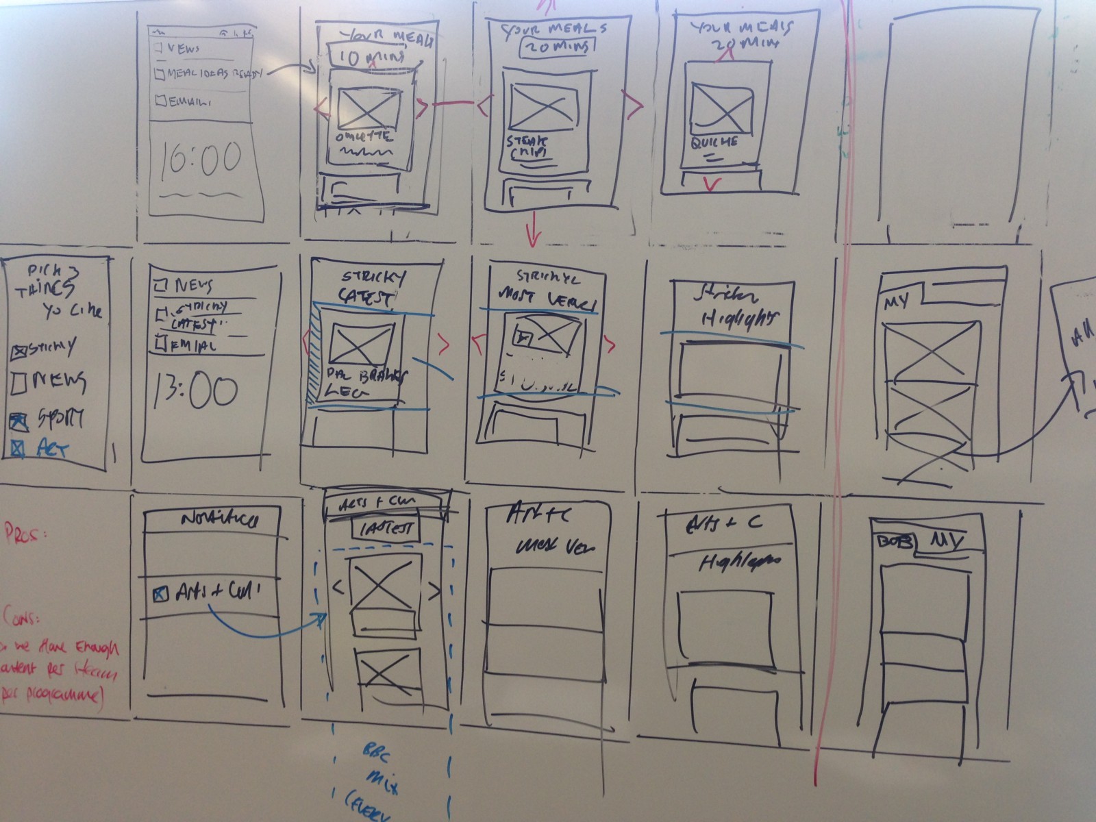
Wireframes
We kept wireframes pretty light, using sketches as a more efficient way of communicating ideas.
We did work up some of the more complicated layouts and interactions to make sure everyone had shared understanding of the concept.
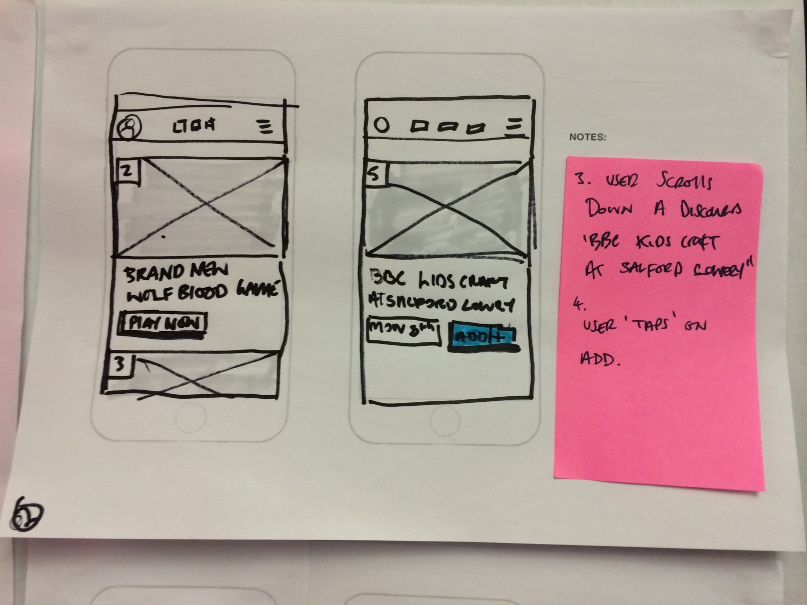
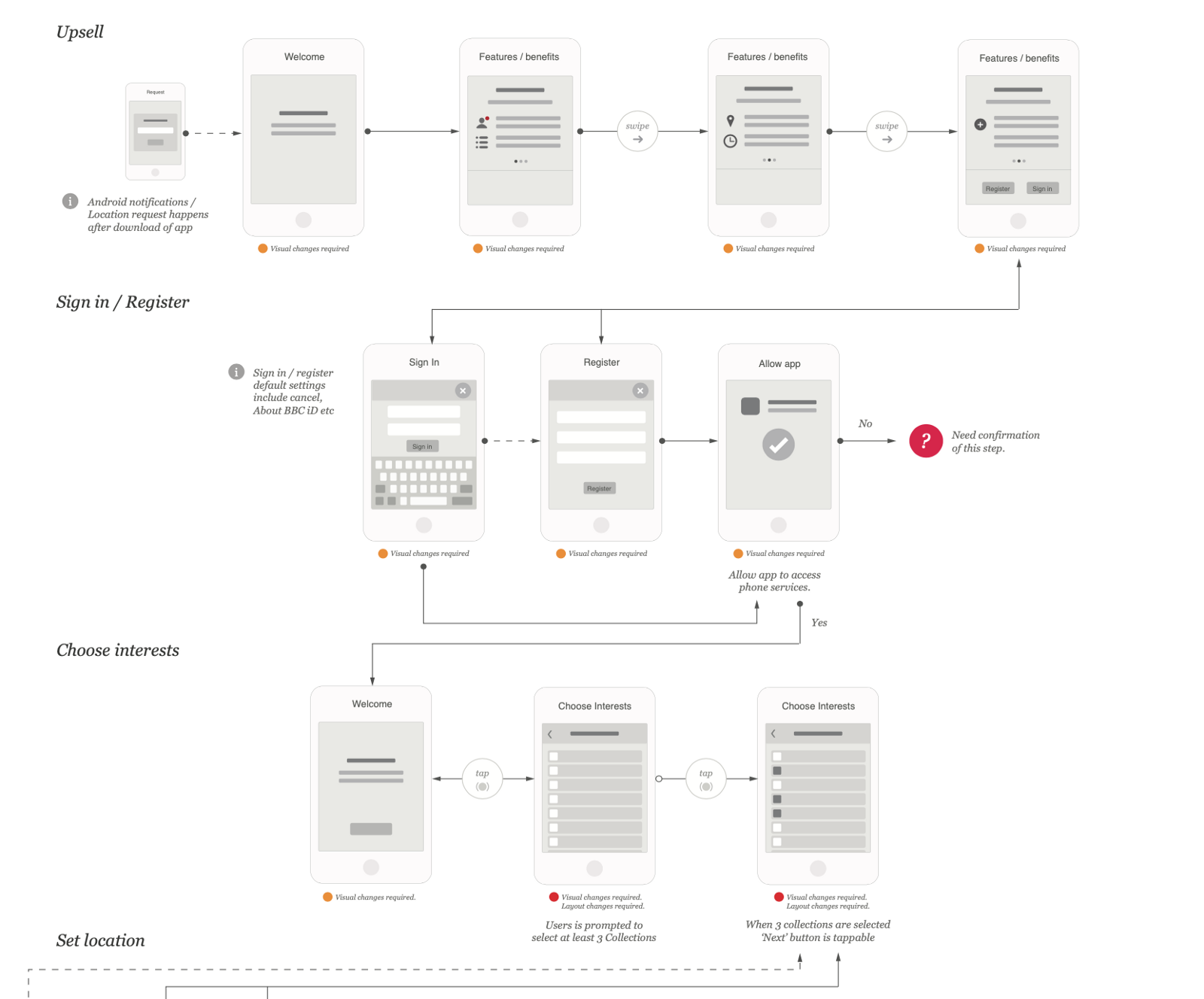
Prototypes
I created a variety of different prototypes at different levels of fidelity. The aim of creating prototypes was:
- To convince ourselves that the interactions we had designed would offer the desired experience
- To test interaction patterns with users
- To communicate interaction requirements to the developers
Early interactive prototypes used to explore interaction patterns
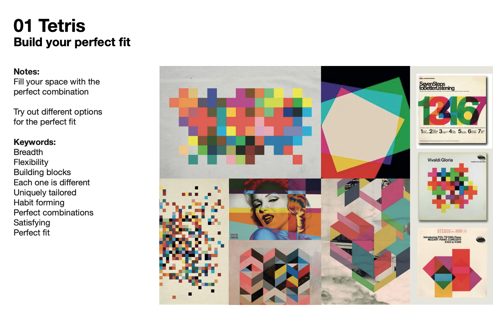
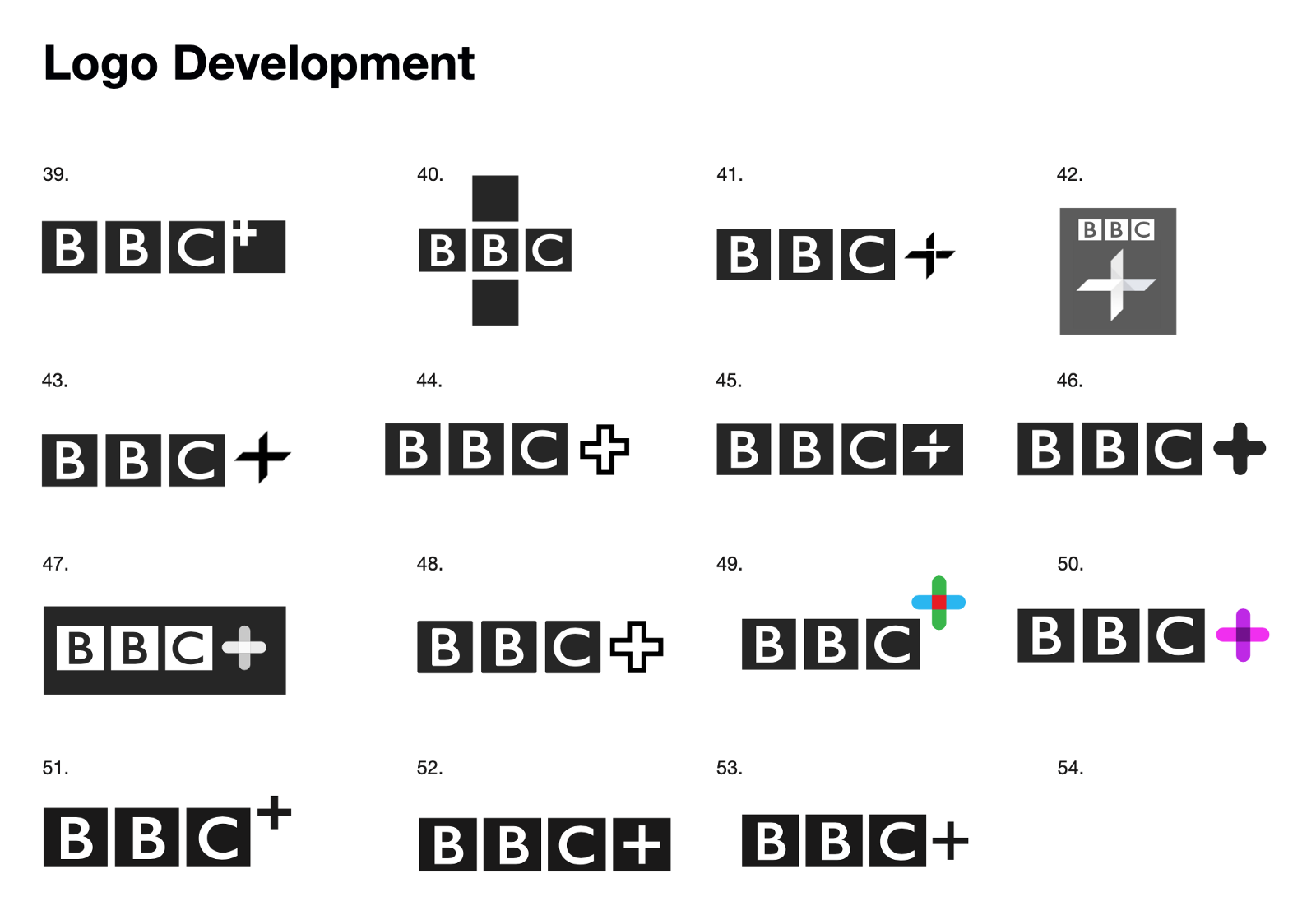
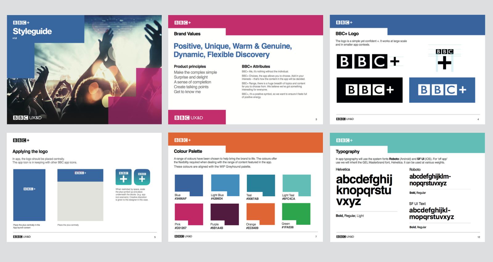
Branding
An unexpected piece of work that I needed to manage was the creation of a new brand for the app. This was due to be completed by an external agency, but plans changed at the last minute and the branding work needed to be completed in-house, without a change to the app launch date.
I ran a design sprint to get to an effective solution as quickly as possible. Designers from the wider team and additional stakeholders took part in the process. Over the course of a week we rapidly developed several different branding routes, and settled on one to be developed and finalised.
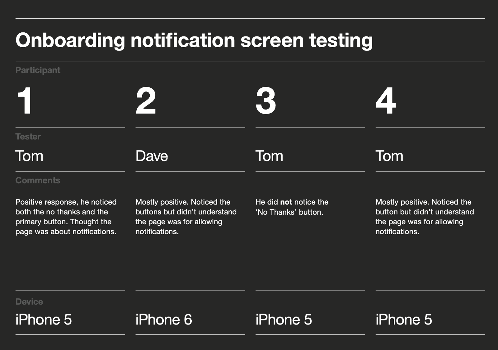
User testing
A really positive aspect of the project were the regular sessions with users to validate ideas and assess usability.
The ideas we developed all went through several rounds of user testing. In general, usability issues were easy to solve, but the trickier problems were around comprehension (e.g. what is this app?) and desirability (e.g. why would I use it?).
We tried many different routes to deal with these problems. Whilst we made some progress, the issues never really went away. By this point the project path was fixed.
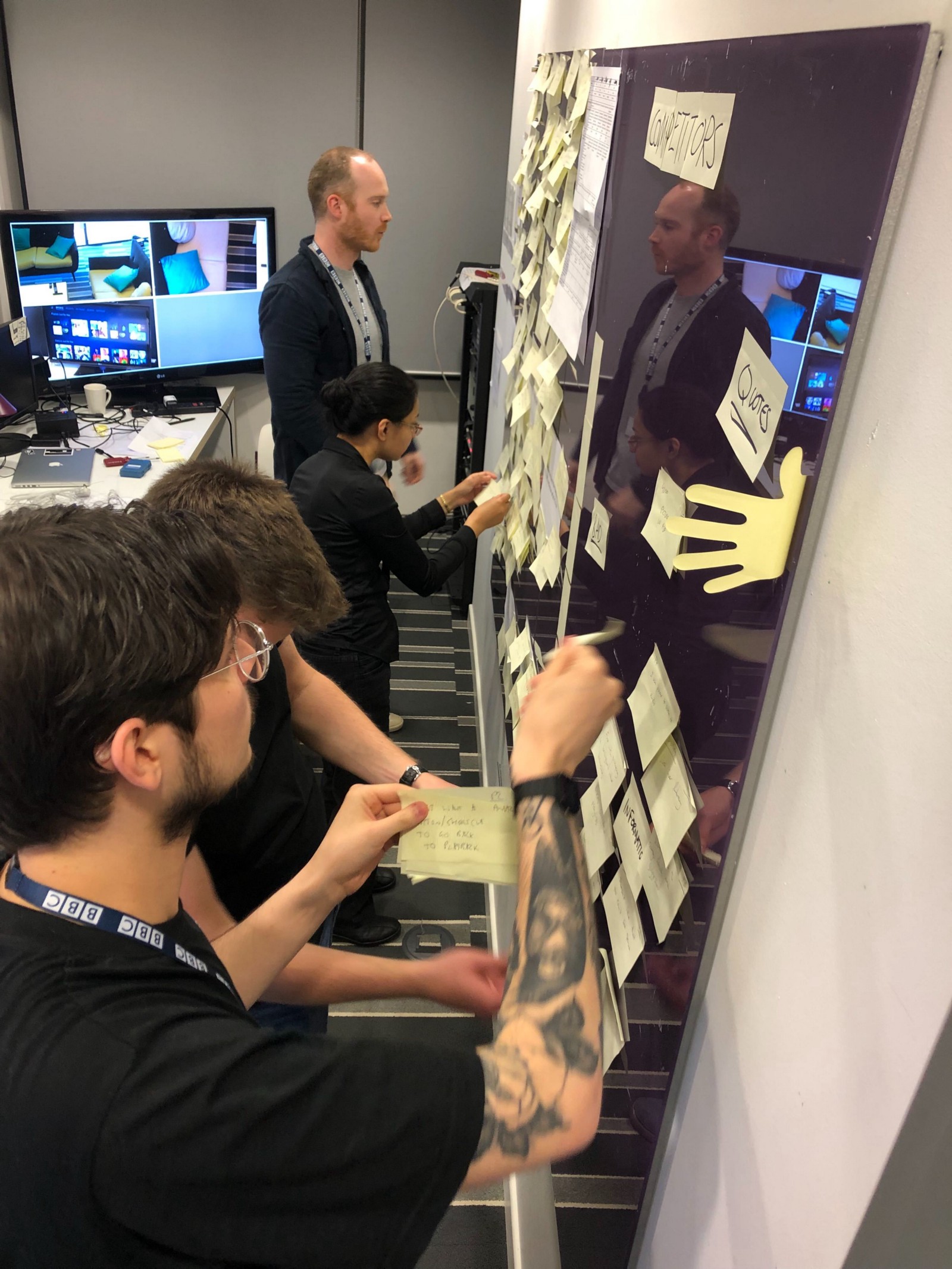
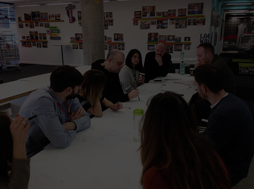
Collating notes after a user interview
Solution
Here’s some key features of the solution we delivered:
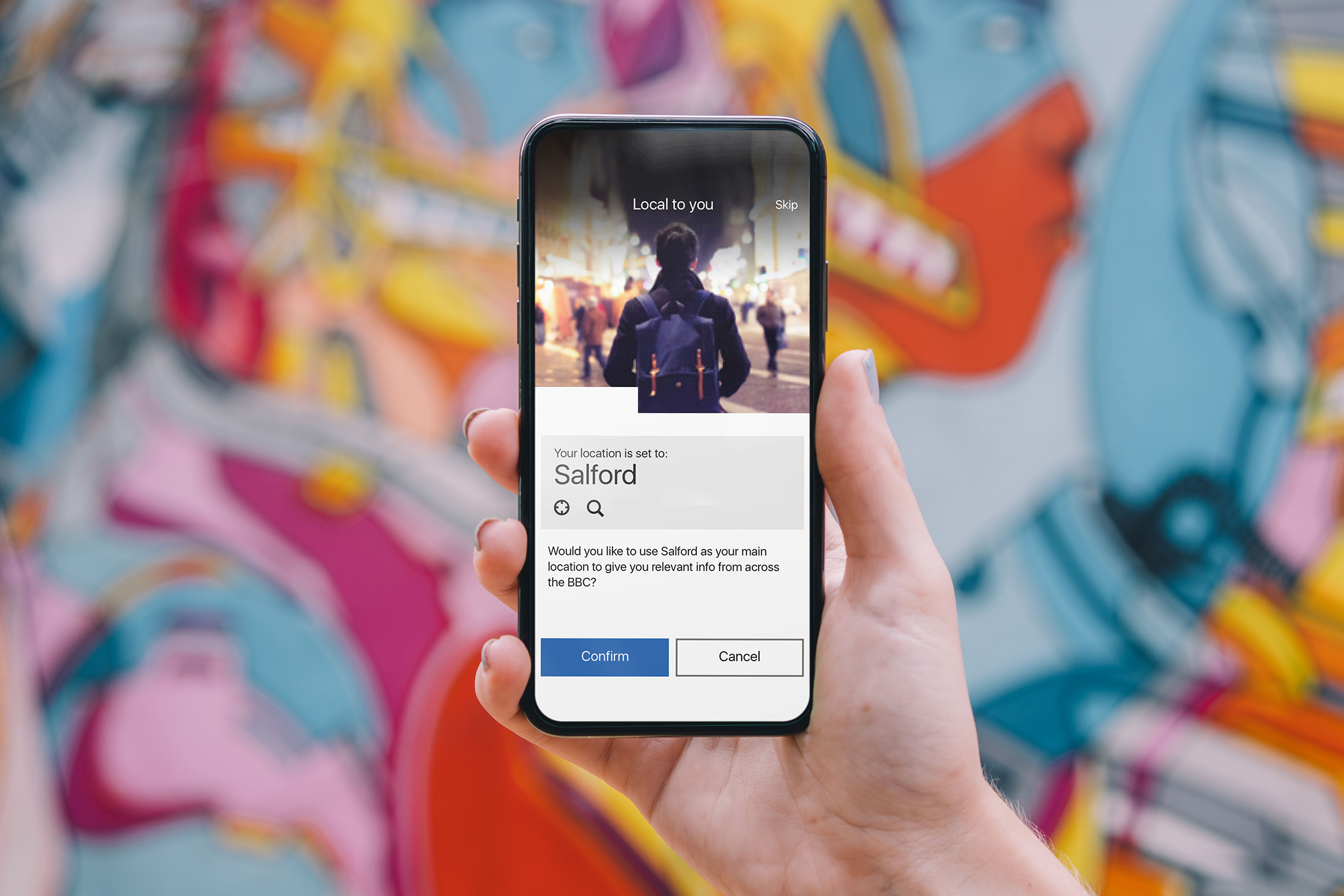
Onboarding
We needed to ensure the onboarding process was quick enough to minimise abandonment, whilst also getting all the information needed for a personalised experience.
We refined the onboarding process through several rounds of user testing, stakeholder feedback and design iterations.
Result: Once the app was launched we could see from the data that the abandonment rate was low enough to be within our acceptable limits.
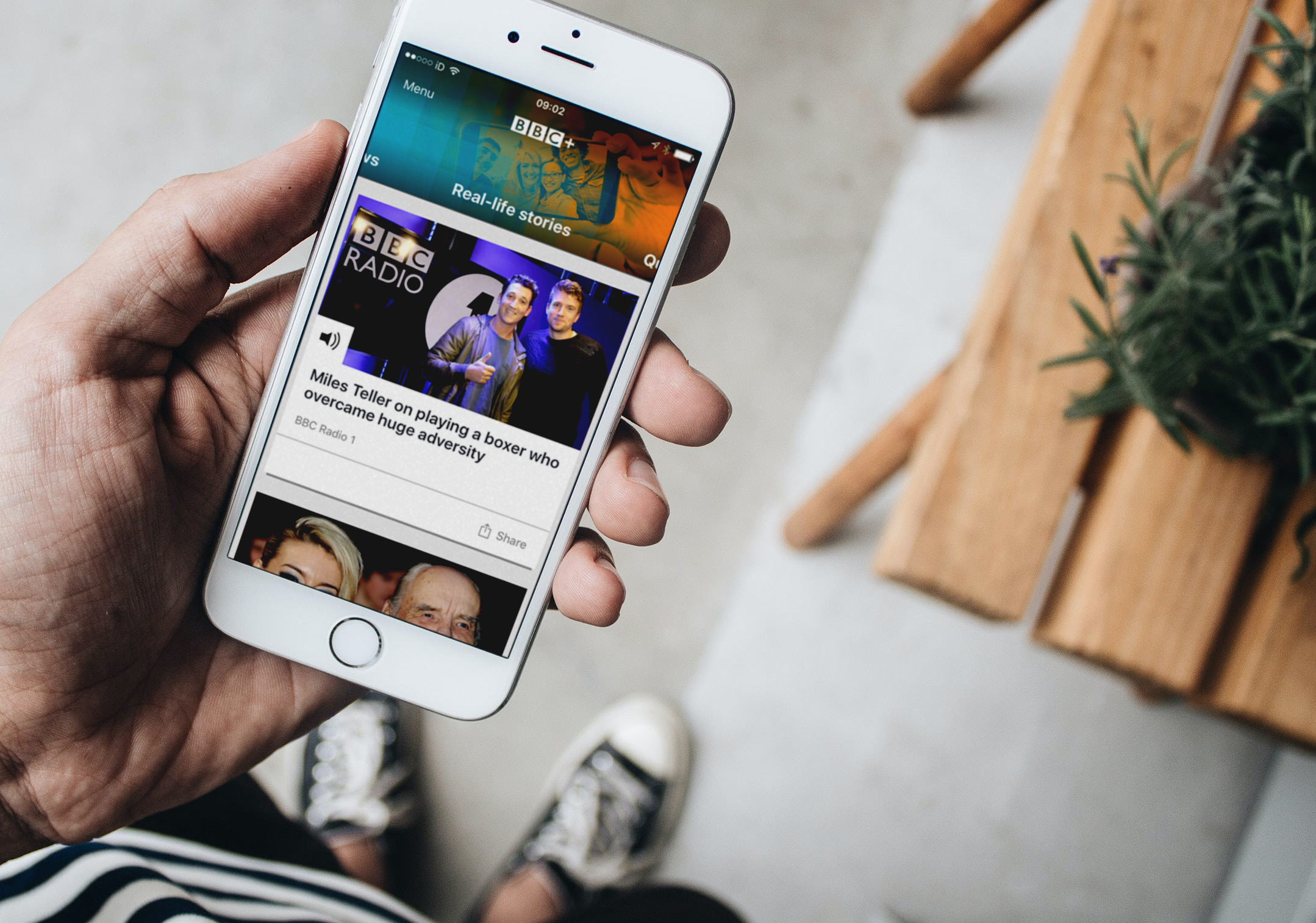
Home feed
Once they set up the app, the user was shown a feed of content based on their preferences.
The idea behind this screen was to give the user snackable content from a mix of regular favourite topics, with some surprises sprinkled in.
I wanted this screen to give a basic user everything they needed - for them to feel satisfied even if they only read the headlines without visiting the articles themselves.
Result: Through usage stats and user feedback we could see that the home feed was well liked by the audience.
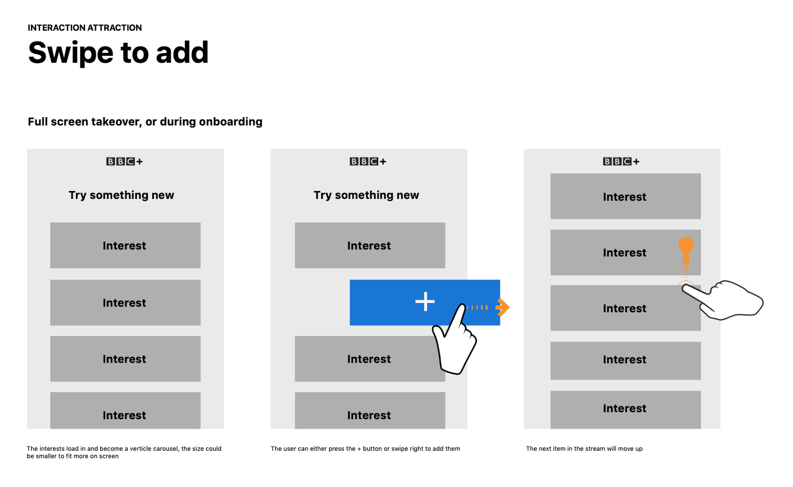
Collections
For more invested users, we offered streams of in-depth content on specific topics of interest.
Our challenge was to work out an interaction method that allowed users to access these streams effortlessly. We tried many different approaches and settled on a swipe-able grid pattern for more casual exploration, plus a navigation menu for getting to specific topics directly (and to make the app more accessible using screenreaders and switch devices).
Result: The pattern tested well and received positive feedback in app store reviews. Usage stats showed that there were two types of users, those that primarily browsed the home feed and those that explored their full set of topics.
End of rail
A key concern we had based on the beta trial was that once users selected topics they were interested in during the onboarding process, they didn’t revist their selections and new topics. We felt that this could lead to users’ feeds getting stale and didn’t give the business a way of promoting new offerings.
We came up with the solution of offering users more choices when they swiped to the end of their chosen topics — a point in their journey when we felt they would be most open to exploring new topics.
Result: When this feature was released we saw an uplift in the rate of collections added to the users’ feeds.
Outcome
After a soft launch where a few refinements were made, the app had a successful marketing launch with press coverage, TV advertising and app store promotions.
This led to a big increase in downloads, but unfortunately the app struggled to retain users.
We were able to iterate on key areas of the app, but we were never able to crack the issue of retention. Ultimately we could never get over the hurdle of users not seeing a place for the app in their lives.
Reflections
BBC+ was one of the most challenging projects I’ve worked on.
It was my first experience working on a native app, and it was exciting launching a high-profile project with lots of pressure and tight deadlines. I enjoyed working with the team - they were inventive, hardworking and good fun.
The biggest challenges came from decisions made before I joined the team, ones that didn't feel right but I wasn't able to change.
Looking back on the project, there’s a few things I learned:
Bad relationships lead to bad products
The tight timeframes and limited scope for adjustment led to a lot of stress in the team. This stress led to a lack of trust and micromanagement, resulting in a reduction in quality of work which in turn created a vicious cycle.
At the time, I deflected as much of the negativity as I could trying to give my team the space they needed to do their job. Now, I feel I have the experience and tools to be able to tackle the problem head on and give the management team what they needed to trust us.
Learn faster
The time to get the product in front of users was too long, especially as we had suspicions that the proposition wouldn’t land with our audience.
I should have done more to work out a way to launch something quicker and learn from real users. This have given us more time to pivot to a more desirable product before funding ran out.
What does the brick want to be?
One practical learning on the delivery of the project is to get input from developers during ideation. Aside from generating more ideas, they would have been able to suggest simpler ways to deliver what users wanted, meaning we’d be able to deliver faster and iterate more.
Credits
UX
Tom Killeen
Katrina Currie
Pete Griffith
Dave Morris
Jag Uppal
Ciaran Withington
Product
Phil Salt
Vivi Campbell
Jen Hopkins